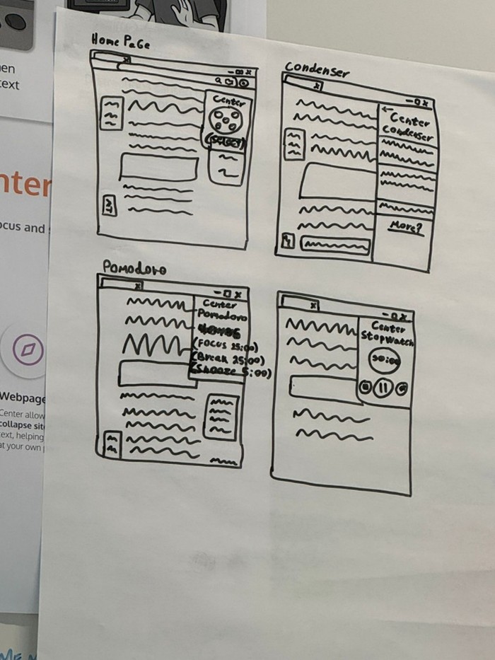
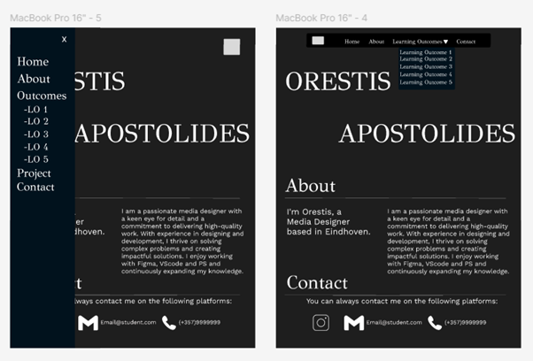
I started the logo design process by creating initial concepts that incorporated the Greek letter "M" since our studio name comes from a Greek word. After receiving feedback about accessibility, I developed multiple new iterations focusing on maintaining fun styling while being more professional. When we still weren't satisfied, I began experimenting with animal incorporation, systematically testing an octopus (for its eight legs symbolizing versatility), then a lion (for strength), and finally settling on a chameleon which perfectly represented our adaptability values. For my portfolio, I researched different websites for inspiration, particularly studying Andrey Mitko's homepage layout and May Collective's image display methods. I combined these influences with my own creative touches to create a newspaper-style structure for the Learning Outcomes page while maintaining consistency across all sections, and consulted with Mr. Amer about navigation options, ultimately choosing a horizontal navbar over a sidebar layout. For the group project I started with paper prototypes to map out basic layouts and user flow before moving to digital Iterations and to also help the team have a clear idea for the next steps.
Learning Outcome 3
Description
You present the successive iterations of your creative process, and the connections between them, of your methodically substantiated, iterative design and development process.
Action

Feedback

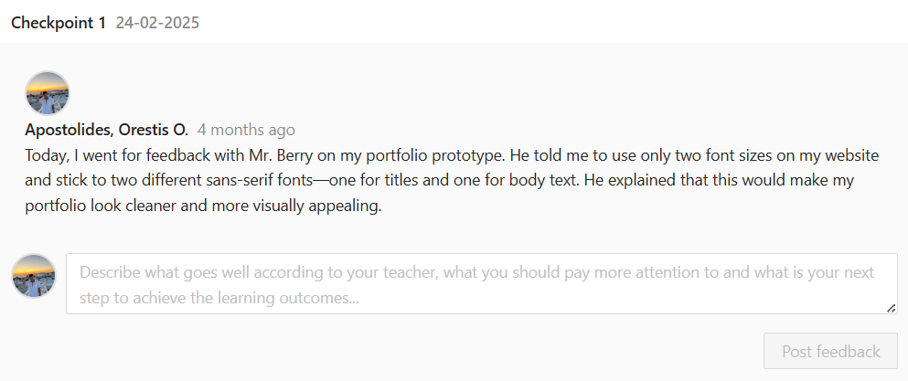
Mr. Chris advised against using the Greek letter "M" in our logo because most people wouldn't recognize it, pushing me to explore more accessible design options. Mr. Barry suggested incorporating an animal into our logo design to better represent our core values and strengths, and also recommended using two different fonts - one for titles and another for body text - to enhance the portfolio's professional appearance. When I consulted Mr. Amer about navigation layouts, he explained that sidebar layouts work better for image-heavy commercial websites, while a horizontal navbar would be more suitable for my portfolio type, and he appreciated the dropdown feature I included for the Learning Outcomes section.
Reflection
This design process taught me the importance of considering your audience when making design decisions - what seems clever or meaningful to me might not be clear to others, as shown with the Greek letter feedback. I learned that incorporating feedback doesn't mean abandoning your creative vision, but rather finding ways to make it more effective and accessible. The experience of testing different animal concepts showed me how collaborative brainstorming can lead to better solutions, especially when we found the chameleon perfectly represented our adaptability values. Starting with paper prototypes was incredibly valuable because it allowed me to work out user flow and identify pain points early, making the transition to digital designs much smoother and more focused. Overall, this process reinforced that good design comes from iteration, feedback, and balancing creativity with usability.RetryClaude can make mistakes. Please double-check responses.